It feels like a lot of time has passed since the launch of iOS 7. Changes that initially [got a lot of people really worked up](http://sloppyui.tumblr.com/) don’t seem to bother anyone anymore. It's strange that we've got used to all those freaky features like psychedelic colors, extreme minimalism and buttons that don’t look like actual buttons.
What’s even more bizarre, we didn’t just stop at accepting those changes. We went one step further, embraced them and started to imitate them in our own designs. I would be lying if I said that I’m not following that very same style.


Yet, there is still one thing that keeps making me sick: the iOS 7 keyboard.


And I’m not talking about its look, which is pretty clean and aesthetic. I’m talking about its usability.
Identifying the culprit


Have you noticed how painfully hard it is to use the iOS 7 keyboard? Personally, I have never experienced so many miss-clicks during text messaging before. Text input on a mobile device has never been perfect but Apple made it even harder.


What’s wrong with the new keyboard? Let’s take a closer look and compare the old iOS 6 and new iOS 7 keyboards. To give you a better idea about the changes, I’ve taken screenshots of both keyboards, patched them together and displayed in a loop. Here’s how it looks:
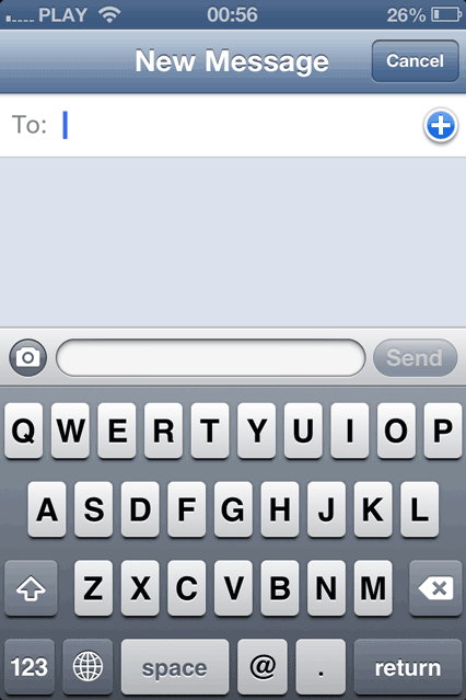
It’s easy to notice the biggest change introduced with iOS 7 – huge decrease in contrast between the buttons and the background.


In the old version, the dark background clearly separates keys from one another, which makes it easier to select the one you intended to. Spaces between buttons are sharp and easily recognizable. Every single key has its own, separate place.


When you take a look at the iOS 7 keyboard, everything seems to blend together. The letters are thinner and less prominent, even though they are slightly bigger.
Applying contrast


Let’s try to fix it. Going with a darker background and white main keys will increase the contrast. I’ll leave lettering as it is. Here’s how it looks like after the changes:
And this is how it looks like when compared to Apple’s design:
The darker background version is obviously much heavier and stronger. However, I believe it is much more usable than the current, faded out iOS 7 keyboard. The difference between individual keyboard elements is clear, which should help immensely with all those miss-clicks.


Good contrast is one of the things that we, and even Apple, tend to forget. Its lack makes some elements, pages or apps hard to read and handle. When there is no clear division between the background and other elements, everything seems to blend together. This can be a huger strain to our vision when reading and a pain when trying to select a particular element.


If you’re not sure as to what contrast levels you should follow, there are a few [contrast standards](http://blackwidows.co.uk/resources/color-contrast-analyser.php) that can be a good starting point. Feel free to hit me up if you need help with adjusting contrast in your works.
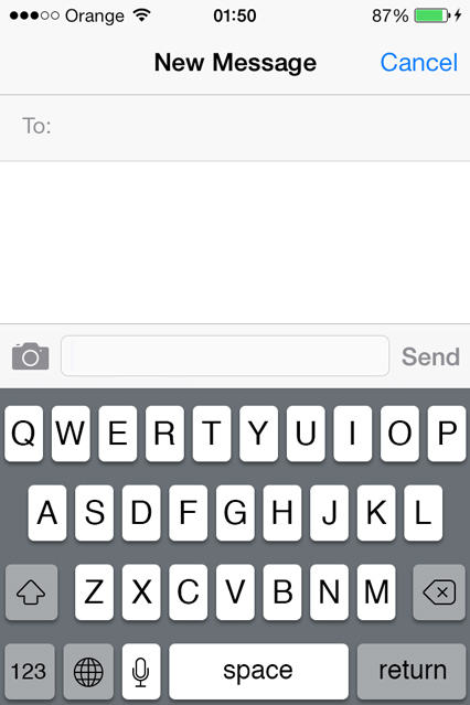
Update
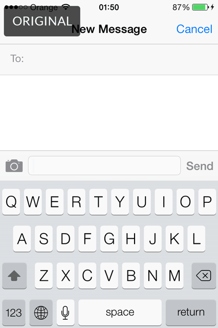
On the very same day we issued this article, Apple surprisingly introduced iOS 7.1 which includes a keyboard update! Well done Apple! However, much to my regret, near to nothing has been made to fix the contrast problems:

The only thing that improves readability in the current design is the increase of letters' weight.
This proposal shows that there is still a lot of space for improvement:


